
Role
UX Researcher
UX Designer
Team Lead
Timeline
2 weeks
Teammates
Erica Congemi, UX Researcher and Designer
Eric West, Lead Designer
Creating a Space for Creators
About Moleskine
Moleskine is a company known best for making luxury notebooks and journals.
Moleskine Smart Writing Set allows the client to use a Smart Pen and Smart Notebook to create art, notes, journaling and other work using the instinctive feel of pen on paper and quickly digitize that work onto the Moleskine Notes app.
.jpg)
.jpg)
The Opportunity
The Solution
Moleskine wanted to create a social networking aspect to incorporate with their Smart Writing Set which would allow users who may want to share their work safely.
Create a customizable sharing platform to allow creators to share their work from the Smart Writing Set, be inspired and connect with others in a safe and personalized way.
Let's talk to the users
Creatives use various online communities to showcase their work, find inspiration, and receive feedback.
We interviewed users who have shared their work publicly online. We wanted to focus on:
1. What motivates you to create or share work?
2. What deters you from creating or sharing?
3. How has your experience been in sharing your work?
I synthesized the user data using an affinity map and found the following user needs:
User Needs
“I need a positive space to share my work.”
Users were often deterred from sharing their work due to potential harassment or negativity on social media platforms.
“I need a smaller, specialized platform to share my work.”
Users enjoyed sharing with other artists and friends, but posting to a large social media platform could be intimidating and possibly out of context for followers.
“I need an outlet where I can be inspired to create.”
Users struggled to be consistent with creating and wanted inspiration from others.
Meet the Creative Thinker
Based on the data, we created the following user persona, Karla.
Karla is a graphic designer who enjoys sharing her creative work with her friends. She works in both the analog and digital medium, and uses the Moleskine Smart Notebook collection to digitize her work. When sharing her work in the past, she has struggled to receive positive engagement on her posts.
Karla needs an easy way to share her ideas and art on a smaller platform, with recognized friends and groups to showcase her work and receive positive engagement.
Karla's Needs:
-
A way to digitally create and share my work with other artists and groups.
-
A way to connect and interact with artists of her choosing.
-
Motivation to draw and create work.

Karla's Needs:
-
People seldom engage with the artwork that she shares.
-
There is no consolidated space for her to be inspired by other peoples' art.
-
Current sharing platforms are too big and generalized for her to share her work.
What is it like for the user to create and share?
I created a journey map to better understand the user experience in creating and sharing their art online.

The Problem:
The user wants an easier way to connect with other artists so that they can feel inspired and receive more engagement on their work.
How can we fix the problem?
My team and I started brainstorming. How could we create a space that would…
-
Encourage consistency?
-
Create a community?
-
Foster positivity?
Our solution was to create a customizable sharing platform, to inspire and connect artists. To address the user problem, we wanted to focus on...
- Provide prompts to improve consistency in creating and posting.
-
Creating groups to connect users and create a sense of community
-
Customization of posting including anonymity and choice of feedback.
In our mid-fidelity prototype, we addressed the user problems by...
Creating a gamify aspect with notifications of posting streaks and daily challenges to inspire and encourage posting
Creating groups for users to connect and post to similar users. to improve sense of community.
Creating toggles for the user to customize who and how others interacted with post to foster positivity

What did the users think?
During usability testing on our mid-fi prototype we asked users to complete the following tasks:
1. You have created a piece of work that you would like to share. Show me how you would post that work.
2. You would like to find and join a new group. Show me how you would do that.
Results: Posting was not intuitive
Task 1: All users were unsuccessful in posting a piece of work with less than 3 errors.
Why? Users were confused by the "start challenge" button. Users were also confused on how to find their most recent work.
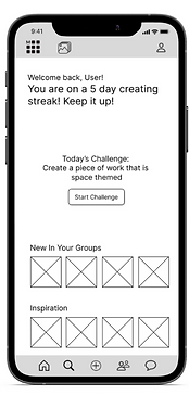
"Do I want to start a challenge
to post something?"
"Did I already draw
something?"
"Where is my art?"
Results: Users wanted to know more about the group
Task 2: All users were successful in finding and adding a group in less than 5 errors
But...
They wanted to know more about that group without clicking through.
"How do I know what
this group is about?"

Let's make this more intuitive
Taking the feedback from usability testing into account we made a few changes when creating our hi-fi prototype.
-
Moved the daily challenge to the profile page, to reduce confusion.
-
Kept the streaks to maintain to encourage consistency.
-
Created a notification and pop up for recently completed work.
-
Added more information to the groups page.
-
Used explore page to improve visibility of groups.
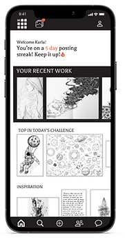


The users approved!
After making these changes, the users were successful at both tasks, with little to no errors.
Next steps
In future iterations I would like to:
Increase security measures
One of the major user pain points that I saw with user research and journey mapping, is that creators are often deterred from sharing due to negative feedback and possible harassment. Although using customization of posting would help mitigate this issue, creating safety features to block users or certain phrases would be beneficial to maintain a positive space
Improve profile page
In the competitive analysis, I saw that the use of a users profile page is important to track user posts, friends and groups, and in this case challenges completed. I would like to ensure that users had quick and easy access to that information in a visually pleasing and intuitive way.
Reflections
-
The view of the user or the viewer?
-
I recognized during this sprint that it was important to understand how each person would view the screen. In returning to this project, I would ensure there was clarity of how the user would see their profile or their own art, compared to other users.
-
-
No design decision is black and white.
-
We used the black and white photos for our hi fidelity prototype because users would be drawing with a pen and uploading that work into the app. However, users are able to add color after uploading. The black and white model was modern and clean looking, but could confuse users.
-
-
Not all social media is created equal.
-
Our C&C was extremely important in this case. Many other social media accounts do similar things and we wanted to stand out. But this was not just another social media app, and it would be benefitial in future iterations to address what people can post to continue to create a safe space for artists to share.
-